
Wednesday, 23 September 2015
Tuesday, 22 September 2015
LO2 - Task 3: Developing Ideas for a Character - Creating an Initial Pencil Sketch
Planning - Hair and Tiara Designs
Before I created my initial pencil sketch of the character, I planned out some of the design such as what hairstyle they would and what they would wear.
Below, you can see the range of hairstyles I designed to see if they would work with my character.


Before I created my initial pencil sketch of the character, I planned out some of the design such as what hairstyle they would and what they would wear.
Below, you can see the range of hairstyles I designed to see if they would work with my character.

These hair styles were mostly inspired by other iconic villains and evil characters. My character is also supposed to act like a celebrity, so they were also inspired by some of the odd hair styles worn by A-list celebrities such as Lady Gaga and Nicki Minaj.

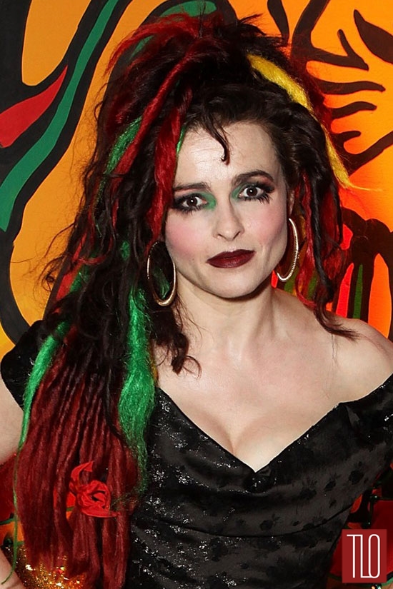
One of the main focuses/inspiration points was Helena Bohnem Carter, who is recognised for her crazy and wild wigs in films. One her most famous character portrayals is the evil Bellatrix Lestrange, who had messy dark hair with a streak of white. I tried to incorporate this design into my own character.

I knew that I wanted my character to have black hair with a streak of white. I chose black as it is connotes evil and so a villain can be distinguished by their black hair through mise-en-scene. I wanted the white streak of hair as it shows the characters age and serves as a contrast to the black hair, showing a contrasting personality, establishing Queen Hellinor as a deceiving character who adopts different personas . The idea of black and white hair was inspired by the iconic hairdos of other villainous characters such as the Bride of Frankenstein and Cruella De Ville.

Still inspired by the Bride of Frankenstein's hair, I originally believed that my character would have a tall beehive hairdo. I attempted three different beehive styles, not only influenced by Bride of Frankenstein but by other figures such as Amy Winehouse and Elvira.

http://www.doctormacro.com/Images/Lanchester,%20Elsa/Annex/Annex%20-%20Lanchester,%20Elsa%20(Bride%20of%20Frankenstein,%20The)_03.jpg
http://www.elviracostume.com/elvira-costume-6.jpg
_03.jpg)
http://www.elviracostume.com/elvira-costume-6.jpg
Initial Pencil Sketches
When designing the rough sketches for my character, I studied the concept art of Marc Davis. Davis was one of the top concept artists for Disney and created the designs for two of their most iconic villains - Maleficent and Cruella De Ville; these character designs helped to inspire my own villain. I copied the dark tones and pointed angles Davis would feature in his designs.

As well as Disney, I also looked at some of the concept art by Dreamworks. My comic is a parody of classic fairy tales, which Dreamworks also aimed to do with their Shrek franchise. Below is a piec of their concept art for Shrek 2, from the book The Art of Dreamworks Animation, the piece depicts some classic fairy tale villains such as the Queen of Hearts and Wicked Witch; both these characters were inspiration for my character.

Below are the initial pencil sketches of my character. I drew her from three different angles - from the front, the back and the side. I then added some colours to the character.


I then drew a more detailed pencil sketch of my character performing an action - a chose to draw her stirring a potion in a cauldron as I plan on her doing this at some point in one of my comic panels and I feel that it reflects her characteristics of a villainous, plotting witch of a character. I improved the colour choices for this as well as I felt that my initial colour choices made the character too loud and colourful and felt that a villain should have a limited colour palet or otherwise they look too appealing and cheerful instead of evil. You can see these changes such as removing the orange and green sleeves and reversing the colour choices of the blue/purple cape and dress.


The Plot: Queen Hellinor is the stereotypical villain with a modern twist. She is an evil queen, movie actress, and the ex-wife of George McLooney (a famous actor and the king of Hollywood). When George McLooney holds a party to celebrate the premiere of his new film, but invites everyone in Hollywood except his ex-wife, she casts a curse of him to get revenge. The curse causes all of King George McLooney future films to be a failure and a flop in the box office. The King, out of embarrasment, goes into hiding. Meanwhile, the King's daughter, Princess Annabel, goes on to be a famous child actress under the stage name Ruby Red (Milly changed her name to avoid being associated with her father and his bad films. For this to work, she also had to pretend that she was one of the commoners of Hollywood, and so gave up her royal title). For her successful movie roles, Ruby won several acting awards.
One day, Queen Hellinor, who has now named herself the ruler of Hollywood (as no one knew what became of the King or the Princess) decides to ask her crystal ball if she is the greatest actress in Hollywood. She is shocked to discover that she isn't, as she can't be recognised as a great actress unless she has an acting award. Queen Hellinor plans to steal an acting award from Ruby Red, but worries that she may be recognised. She goes to a Hollywood costume department and dresses up in one of their wolf costumes to disguise herself.
One day, Ruby Red, hidden from paparazzi in a red cloak, goes deep into the dark woods of Hollywood. In the deep dark woods of Hollywood is where her father is hiding, who she is going to meet. On her way, she bumps into Queen Hellinor who is disguised as a wolf. Queen Hellinor tries to grab an award from Ruby's basket; Ruby recognises Hellinor from her bad acting, but runs off, pretending to be scared to humour her. Hellinor, missing her chance, tries again by breaking into King George's house and locking him in the cupboard. When Ruby arrives at the house, Hellinor is hidden under the bed sheets and pretending to be the King. Again, Ruby isn't convinced, but chooses to go along with it. When Hellinor reveals that it was her the whole time, Ruby acts as if she's shocked; Ruby then goes onto compliment Hellinor's great acting skills as a wolf. "We need a wolf for the film I'm working on..." Ruby continues, and offers the job to Hellinor. Hellinor, complimented and unable to turn down an acting opportunity, agrees to be in the film. Ruby takes Hellinor (still in wolf costume) to the study and tells her that for this scene she needs to stick her head through a hole in a wall (explains that it's the logo - similiar style to MGM Lion logo). Hellinor, believing that their's a camera on the other side of the wall, sticks her head through the hole. However, the only thing on the other side of the wall is a guillotine with Ruby pulling the rope. The next action is unseen. The story concludes with Ruby returning to the palace and naming herself the new Queen of Hollywod. It is also stated that Queen Hellinor, who wanted to steal one of Ruby's trophey, has instead become a hunting trophey.
The Character: Queen Hellinor is the stereotypical villain with a modern twist. She is
an evil queen, movie actress, and the ex-wife of George McLooney (a
famous actor and the king of Hollywood). She is vain and self-obsessed and will do anything to stay on top of the social ladder. She is also selfish and causes misery to others. She posses magical powers and items such as potions and crystal balls. She also owns the luxurys that come with living the life of a celebrity/royalty, such as a big castle, access to different dresses and costumes, etc. She has starred in multiple movies, often playing the love interest.
Monday, 21 September 2015
LO2 - Task 3: Developing Ideas for a Character - Moodboard for Character
Below is the moodboard I created when planning my character.


LO2 - Task 3: Developing Ideas for a Character - Mindmap
Below is the mindmap for my chosen comic character, Queen Hellinor. In the mindmap I planned information for the character back story, inspirations sources, her appearance and other characteristics.


Thursday, 10 September 2015
LO1 - Task 2: Analysis of a Graphic Novel or Comic
 *
*Genre -
The genre of this comic is horror as it is a fictional psychological thriller. From studying the cover you can guess that it's a horror from the dark styled art and the inclusion of horror-related words such as 'Terror'.
Content and Style -
The Crypt of Terror is an anthology comic series, including two text stories and four different comics per issue. I will be focusing on just one of the comic stories, titled 'The Curse of the Full Moon', which serves as the lead story, meaning it was used to inspire the comic's cover to promote the issue. The style for all the comics is dark and realistic as opposed to a cartoon-like style. It also follows the traditional style of most comics 1950's, choosing a pop art comic style.
This comic is panelled out traditionally, with each page featuring around 7 panels. The only page that doesn't include around 7 panels, besides the cover, is the opening page to the story which devotes over half the page to an image of a werewolf attacking a city. Whilst a giant werewolf doesn't appear in the story, nor does this yet have anything to do with plot and doesn't fit in terms of a linear storyline. However, this image is used to summarise what the comic will include: A werewolf, clarified as the main focus, who is at large in the city, which is represented literally in this image. Another important feature is the full moon, which is also presented in the opening panel and written in large text for emphasis.

As well as being presented in large, bold, capital letters in the title, the words '...full moon...' are emphasized in other sections of text in the comic. For example, in the final panel, the words are presented in a thick, italic font to make them stand out against the rest of the text. Other examples of words written in bold italics appear in the spoken dialogue; these are used to emphasise the spoken tone and so are used for dramatic effect for the heated discussion between Ralph and George. The words are sometimes shown at an angle to show an inclination in the characters voice, usually to show their surprise to add emotion to the dialogue.

Besides the font style and punctuation, the dialogue is also aided by speech-bubbles, thought bubbles and radio/electric balloon. These are traditional and conventional ways to show dialogue in a comic.

Although most panels follow traditional style, some experimental panels are used. For example, a montage is created in one panel to summarise the highlights of the 'exciting Paris night life'. It shows such imagery and symbolism such as musical to connote the music, bubbles and stars for the sparkling wine, etc.

Some of the panels in the comic completely lack dialogue or captions, but instead rely on visual narrative. For example, Ralph hears the news of a woman being killed and her body missing a shoe when discovered. The next two panels only use visual narrative to show Ralph searching through his items and discovering the show amongst his possessions. The reader, when analysing these images, can also understand Ralph urgency as we can see he searching through his items quickly by clumsily throwing them out of the way, and we then see the shock on Ralph's face when he discovers the shoe, in a gasp position as he starts to realise that he is guilty for the murder. The reveal of Ralph owning the murdered girls shoe would also shock the readers so his reaction may reflect how the readers would react. Ralph holding the shoe is shown in the background, whilst his bedroom lamp is in the foreground; this almost makes the action hidden to make the reader feel as though their witnessing something they're not supposed to see. The lamp is also used to create some interesting lighting against the dark tones, as it causes Ralph to be covered in shadow, which could connote how there is still a lot of mystery to this story and how Ralph is still in the dark about what's happening. However, the light also shines on him to put emphasis on his shocked face and the show in his hand; this could also connote how Ralph is the main focus of the story and the crime, as if he's standing in the spotlight.

Interestingly, the story seems to be nonlinear as a majority of it is told in flashback. The story starts by being explained in captions, but the middle section is explained in quotes by Ralph, recounting what had previously happened to his friend George, before returning to normal time and going back to the narrative being told in traditional caption style. The change in narrative is made clear from the addition of quotation marks and a slight alteration in font. Due to a majority of the story being presented by Ralph, the narrative is told by an unreliable narrator - this is why some panels feature images a werewolf, even though the ending reveals that there never was a werewolf, it was just in his head and so that's how he explains it.
One of the opening captions....

Mid-section caption, being told by Ralph...

One of the closing captions...

The cover for the comic is made to be eye-catching with sharp and contrasting colours. It also features dark humour and irony, as it comically depicts a woman being stalked by a werewolf, whilst in the foreground is a newspaper reporting the previous werewolf attack and stating '...city awaits next victim...', predicting and foreshadowing this woman's fait. This also strikes people's curiosity as they want to know what has lead to these events, persuading them to buy the comic to find out.
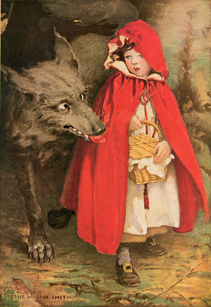
The cover shows a scene that is set in an alley way in a suburban city. From the dark colours such as the shadows cast on the walls, we can easily assume that it's night time. The dark colours also create an unsafe atmosphere, as a more colourful and welcoming setting wouldn't create the sense of danger that this dark alley way makes. By setting it in an unsettling area follows traditional horror conventions and mise-en-scène. The only subjects on the cover that are brightly coloured are the werewolf and the woman. The werewolf has bright red eyes to make him more monstrous and dehumanised. His dark blue suit allows him to blend in better to the surrounding background and not stand out as much as the woman. The woman stands out as she is costumed in bright and colourful clothing made to contrast with the rest of the cover and the comic, displaying her as a victim that is easily seen by the werewolf. One of the woman's most prominent colours is yellow, which is often associated with joy, which contrasts with the theme of the comic and the dangerous scene around her. She is also wearing a red shirt, which could connote the red cloak worn by Red Riding Hood, who similarly shares the image of being dressed in red whilst in a dangerous area being stalked by a wolf. The artist was most likely inspired by this fairy tale when designing the cover. The image of someone in a dangerous area dressed in red connotes the person as being a bull's-eye or easy target or prey.

The connection between Little Red Riding Hood to show the woman's danger is not the only iconography technique. The cover also depicts a black cat, which is often shown to connote bad luck in superstition, as the woman on the cover is about to be involved in an unlucky situation. The super natural and superstition were two key factors in these graphic novels and how their stories were told and inspired.
The comic panels themselves are black and white. Whilst someone could assume that the lack of colour is to save on the cost of ink, you could also argue that it is to pay homage to the black and white horror films that many of the comics were based on. This comic was most likely inspired by black and white horror films such as 1941's The Wolf Man. Black and white hammer horror films such as this may have inspired some of the comic plot points and story-lines, but also the artistic style. Due to the lack of colour in these films, the use of lighting became more important to highlight certain aspects and add shadows to other scenes to create an unnerving atmosphere. This technique was picked up by the comic artists and inkers and so shadowed tones are often included in panels to match the haunting atmosphere.

In this comic, black and white are used to create a contrast. White is used to highlight something important, whilst black is used for mystery by leaving something unknown in the dark or shadows. In George's house, nothing is visible in the darkness apart from George and Ralph. This makes the setting more mysterious and worrying as we are unaware of what sort of surrounding this is. It also emphasises the main focus of these character. Another subject that is emphasised in the moon, which serves as the main source of light. The moon is a major plot point of this comic, so the inker makes sure to keep it as a constant reminder to the reader by having it appear in most panels in the background. At one point, the moonlight cast an oval shaped light directly onto George; not only does this highlight the character by putting him in a spotlight, it could also be foreshadowing as George later declares himself to be a werewolf after standing directly in front of the full moon. The image of the moon at this stage could be iconography as a full moon, as well as being synonymous with werewolves, also connote lunacy; this explains why it is seen when Ralph believes he is insane and George reveals that he is mad.

The captions supply anchorage as they tell the story and give specific pieces of information to the reader. For example, from one of the opening captions we already know that it's raining, that it's set in Gotham and that it takes place at night.

The language used by Ralph is supposed to be spontaneous and natural. Ralph is also supposed to feel guilty and awkward because he believes he's committed murder but he's trying to keep it secret. To show how he's feeling, Ralph's speech is full of gaps, ellipses, and repetition as he's uncomfortable and seems unsure of himself and what to say or how to go about saying it to George.

Another interesting artistic choice is how the dialogue is presented. Although it mostly uses speech bubbles, a conventional way to present dialogue in comics, it also experiments with different types to show voices in a different tone. A thought bubble in the shape of a cloud is used to clarify what Ralph is thinking, as a cloud can connote dreams or thoughts. A spiked and pointed electric/radio balloon is used for the radio broadcast to show readers that it is a transmitted voice; the zigzag effect also makes the voice seem less human, showing that the voice is coming from a radio and not a person. By also making the electric/radio balloon look similar to a lighting bolt could also connote how shocking this piece of news/dialogue is to the story.
Different angle types appear amongst the panels. At one point, a close up of Ralph's hand is used to show the hat he is holding. This prop is a shocking item in the story as it is evidence of Ralph committing a murder, so it's importance to the story is shown in a full panel close up so that the reader will put all their attention on it. Props such as the hat and the shoe play a crucial part to the storyline as they each make Ralph feel more guilty as they seem to certify that he is the mystery murderer and can serve as misleading clues to the reader. Again, shading is used around the frame to highlight the object in the centre.

The inker has also experimented with depth of field. In one panel, an over the shoulder view of the werewolf is used to show him approaching an oblivious victim. In another panel, it shows the werewolf about to attack another victim, but this time the oblivious victim is in the foreground and the werewolf is the background. This allows the reader to have a different perspectives on the attacks. The panel used where the werewolf is in the background is an interesting choice as the werewolf's image is not clear as he's obscured in shadows, so this might not be a werewolf at all - this may in fact be George, who later reveals that he was the murderer. Of course this type of foreshadowing isn't clear (adding to the mystery), and the reader wouldn't realise this at first, and may only notice upon re-reading the comic.

Target Audience -
Despite the fact that the comics tried to cut down on the amounts of horror by including humour and puns, it is still clear from the gory nature that these were intended for a more mature audience who are old enough to cope with the grotesque imagery. This specific comic itself contains no puns or humour and contains adult themes such as mental disorders and murder, so this was clearly meant for a more mature audience as recognised from its adult content.
This specific comic is meant to appeal to men, as the main characters are all male and any female character is only a background/minor character who doesn't speak nor have any effect on the story. Since the main characters are men, the male readers will find it more identifiable and understand the male characters better. This comic was created in the 50's, when it was highly believed that the horror genre appealed more to men than women as they wouldn't be as easily scared by it and find it more interesting and thrilling. Therefore, the comics are highly marketed at men, with female character being rare except for stories involving troubled relationships or romance.
Characters -
One of the only re-occurring characters in The Crypt of Terror/Tales from the Crypt is The Crypt Keeper, who helps to serve the stories narrative. Knowing all these stories and important details about other characters makes The Crypt Keeper an omnipotent figure and he's kept as a mysterious man. The Crypt Keeper's eccentric personality is established through his dark sense of humour, often using word play to incorporate words of a sinister manner into mundane sentences. The Crypt Keeper appealed to the target audience as he served as comedic relief from the dark natured stories. However, the Crypt Keeper plays no major part in the comics themselves most of the time, other than to introduce and/or conclude the comic.
Whilst the narrative is supposed to be a story by the Crypt Keeper, a majority of this specific comic is told by the lead character, Ralph. Ralph is often shown with a look of fear or guilt, as the plot is about how he believes that he has become a werewolf and obliviously committed murders in the night. Due to this, Ralph now fears full moons as he worries he won't be able to control his actions. Ralph's character development is how he becomes stressed as more people are murdered as he becomes more certain each time that what he believes is true, and his coping process as George assures him that he's not a werewolf. Although Ralph is the main focus of the comic and the character we follow throughout, it is challenging to label him as the hero as for the large part of the story we believe him to be guilty of the crimes as well. However, in terms of Binary opposition, it is evident from his innocence that he is intended to be a protagonist in some sense.
Another character that plays a large part in this comic is George. The reader understands George to be Ralph's friend and a welcoming and helpful character as his first action in the become is aiding Ralph in taking his wet clothes off and getting him to relax. George's friendly and helpful personality continues throughout the comic until the last few panels when George reveals the plot twist that he was the murderer all along, he was framing Ralph for his crimes, and that he's now going to kill Ralph because he knows too much. This make George the antagonist of the comic. The change in George's personality is also shown in his appearance by the inkers as his hair becomes messier and his eyes become bulged. Fans of these comics enjoy well-crafted villains and antagonists and even more so - the plot twists; due to these likeable aspects, I can assume that most readers would have enjoyed the surprise ending involving George and that he would have been an interesting character that would have prompted a re-read from his shocking reveal.

*Many of the graphic novel images featured are from The Crypt of Terror issue no.17's comic The Curse of the Full Moon by EC Comics.
Wednesday, 9 September 2015
LO1 - Task 1: Graphic Novels and Publishers
Starter - How do comics and graphic novels have an effect? What do comics and graphic novels have an effect on?
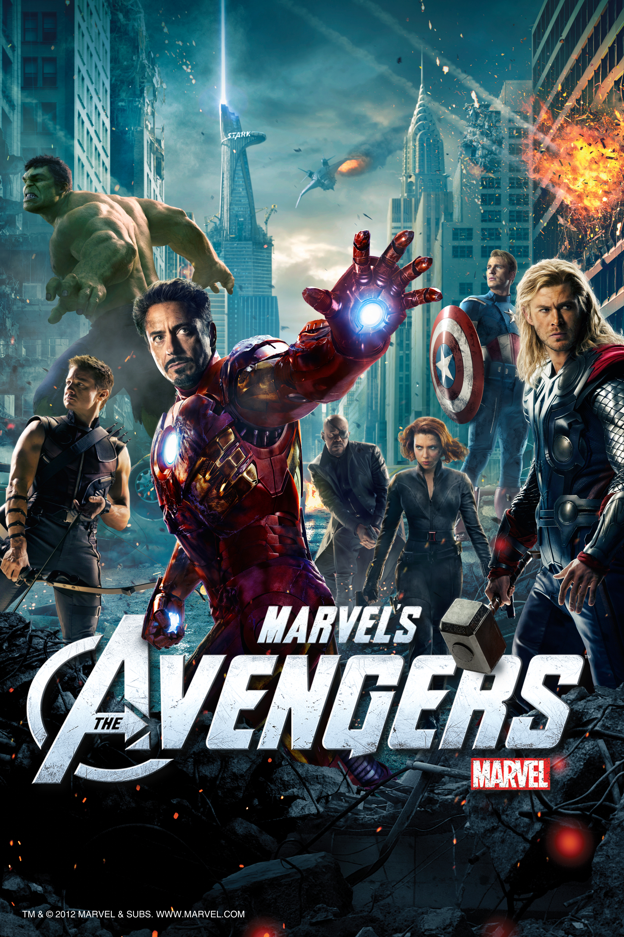
Comics and graphic novels have had a major impact on the film industry. Movies based upon comic book characters have had a great success and many fall under the superhero or action genre.
 http://a4.mzstatic.com/us/r1000/088/Video/v4/88/cf/0b/88cf0b0f-4c4b-fbda-c4a3-f15ec5392e25/mza_5059262374444342889.jpg
Above is a poster for 'Th Avengers', a film adaptation of the comic series. It was the highest grossing films of 2012 and remains one of the highest grossing films of all time (not adjusted for inflation).
Comics and graphic novels have inspires merchandise such as toys and costumes that relate to the original comic products.
 http://media.creativebloq.futurecdn.net/sites/creativebloq.com/files/articles/article/2012/07/batconverse.jpg
Above is a purchasable clothing item: footwear with Batman comic styled print on the material.
Comics and graphic novels have inspired related mass events like Comic Con where fans can attend to celebrate their favourite comics and characters.
 http://a57.foxnews.com/global.fncstatic.com/static/managed/img/fn2/feeds/Associated%20Press/2014/07/24/876/493/2014%20Comic-Con%20-%20Preview%20Night-4.jpg?ve=1&tl=1
Above is a photo from a Comic Con event showing a Gaurdians of the Galaxy fan posing for a selfie next to a figure of one of the characters. Guardians of the Galxy also inpired a cinematic remake.
Task 1
Comic and graphic novel job roles:
The writer creates the narrative, dialogue and story.
The pencilers design and illustrator.
The letterers choose the type fonts.
The inkers and colourists create atmosphere through illustrations using colour and shading.
EC Comics
EC comics is a subsidiary publishing company owned by DC. Originally called Educational Comics, the company re-branded itself to Entertaining Comics as they wanted to reach a larger audience and felt that by targeting people with entertaining comics rather than educational comics they would a gain a larger audience. This re-brand allowed for more interesting comics and a wider variety of genres. Listed below are five examples of comics published by the company.
1. The Vault of Horror
 http://images.wwcomics.com/images/large/VoH_19_Q85.jpg
Title: The Vault of Horror
Product: Graphic novel. Anthology comics.
Writers - Al Feldstien, Bill Gaines, Johnny Craig
Pencilers - Graham Ingels, Jack Davis, Jack Kamen, Johnny Craig
Letterers - Unknown
Inkers - Graham Ingels, Jack Davis, Jack Kamen, Johnny Craig
Colourists - Al Feldstien
http://www.comicvine.com/vault-of-horror-19/4000-100704/
Above is the cover for 19th addition of The Vault of Horror. The cover was created by penciler Johnny Craig, who also served as the writer of the lead story. The cover includes dramatic irony, as the woman states she wants Ralph back, unaware that the undead Ralph is behind her.
The Vault of Horror was a collection of comics that would include original and illustrated horror novels. The comics became popular due to their plot twists and supernatural content that influenced the dark and gothic art style.The success of this comic series inspired future comics by EC such as the next two examples listed below. This started the EC horror genre comics. The next two collections of graphic horror novels would include almost identicle styled content, following the same style of dark and often gorey illustrations.
The Vault of Horror soon inspired a full length live-action horror anthology movie of the same name, however none of the stories included in the film originated from the comics; A majority of the stories actually appeared in Tales from the Crypt, a partner comic series. Some call this film a sequel to the original Tales from the Crypt film.
2. Tales From the Crypt
 http://cdn.fontmeme.com/images/Tales-from-the-Crypt-Poster.jpg
Title: Tales from the Crypt/The Crypt of Terror
Product: Graphic novel. Anthology comics.
Writers - Al Feldstien,
Pencilers - Al Feldstien, Graham Ingels, Jack Davis, Jack Kamen, Jo Orlando
Letterers - Unknown
Inkers - Al Feldstien, Graham Ingels, Jack Davis, Jack Kamen, Jo Orlando
Colourists - Al Feldstien
Above is the cover for the 28th addition to the Tales from the Crypt series. The cover was created by penciler Al Feldstien, who also wrote the lead story and worked as an inker. This cover allows for an interesting perspective as it allows the reader to view a scene which takes place both underground and above ground.
Tales from the Crypt was the third instalment to the collection of the dark comic series, yet the name is probably the best recognised comic from the company except for possible Mad magazine.
Tales of the Crypt is probably best known for their infamous mascot, The Crypt Keeper, one of the only reoccuring characters in the series along with The Vault Keeper and The Old Witch, all recognisable from their old and decreped appearance, their constant rivalry with each other, and their dark humoured wordplay.
Tales from the Crypt inspired a full length live-action horror anthology movie of the same name, as well as other horror films based on some of the stories featured in the comics. The comics also inspired three successful TV series, titled 'Tales from the Crypt', 'Tales from the Cryptkeeper' and 'New Tales from the Cryptkeeper '. The comics and the character have camoed in other popular culture, such as a refrence in the film Freaky Friday and parodied by The Simpsons.
3. Haunts of Fear
 https://d1466nnw0ex81e.cloudfront.net/n_iv/600/705439.jpg
Title: Haunts of Fear
Product: Graphic novel. Anthology comics.
Writers - Al Feldstien, Gardner Fox
Pencilers - Al Feldstien, Graham Ingels, Jack Davis, Jack Kamen, Wally Wood
Letterers - Unknown
Inkers - Al Feldstien, Graham Ingels, Jack Davis, Jack Kamen, Jo Orlando
Colourists - Marie Severin
Above is one of the covers to a copy of The Haunt of Fear illustrated by penciler Al Feldstien, who also wrote the lead story and worked as an inker. This cover, similarly to the Vault of Horror cover, also includes dramatic irony, with the perplexed man unaware that the missing mummy is standing behind him.
The Haunt of Fear served as a sister-comic to The Vault of Horror and Tales from the Crypt, but didn't reach the the same social status as the other two. The reasons why are not apparent.
4. Mad
 http://www.comicbookbrain.com/_imagery/2012-08-24/cover-mad-magazine-superman-iii-620.jpg
Title: Mad
Product: Satirical comic.
Penciler: Richard Williams
Inker:Richard Williams
Colourist:Richard Williams
Above is a cover of one of the copies of Mad Magazine illustrated by penciller and inker Richard Williams. The cover comically depicts Superman, (the main protagonist for DC comics), sat reading a copy of Mad magazine with the mascots face on the front, which blends seemlessly onto Supermans body.
Mad magazine was created to include comics that would satire politics and popular culture. Mad became recognised for it's wit, parody and caricature art style.
Mad inspired merchandise such as bobble heads and t-shirts featuring the iconic image of their main character/mascot Alfred. It also inspired an animated TV show of the same name which lasted three years.
Unlike the previous three comic examples, Mad magazine uses comedy rather than being part of the horror genre, appealing to a different type of audience with different interests. This shows that whilst the company found a market with their horror graphic novels, the can also work to different mediums and genres to expand their products to different audiences.
5. Moon Girl
 http://static.comicvine.com/uploads/original/1/10812/1614332-moon_girl_no_3_page_sheldon_moldoff_art_spring_1948_ec_comics.jpg
Title: Moon Girl/ Moon Girl and the Prince
Product: Action/superhero graphic novel.
Penciler: Sheldon Moldoff
Inker: Sheldon Moldoff
Above is a cover for Moon Girl illustrated by penciler and inker Sheldon Moldoff, who famously designed some of the original Batman characters for DC.The narrative was written by Gardner Fox
Moon Girl was created to compete with the success of other superhero comics by other publishing companies (In a time now nicknamed 'The Golden Age of Comic Books'), mostly to compete with the newly popular DC character Wonder Woman, in the hopes that a super heroin would attract a larger audience by appealing to both genders and show gender equality in the company. EC no longer hold copyright to Moon Girl as it now under public domain.
Comics and graphic novels have had a major impact on the film industry. Movies based upon comic book characters have had a great success and many fall under the superhero or action genre.

Above is a poster for 'Th Avengers', a film adaptation of the comic series. It was the highest grossing films of 2012 and remains one of the highest grossing films of all time (not adjusted for inflation).
Comics and graphic novels have inspires merchandise such as toys and costumes that relate to the original comic products.

Above is a purchasable clothing item: footwear with Batman comic styled print on the material.
Comics and graphic novels have inspired related mass events like Comic Con where fans can attend to celebrate their favourite comics and characters.

Above is a photo from a Comic Con event showing a Gaurdians of the Galaxy fan posing for a selfie next to a figure of one of the characters. Guardians of the Galxy also inpired a cinematic remake.
Task 1
Comic and graphic novel job roles:
The writer creates the narrative, dialogue and story.
The pencilers design and illustrator.
The letterers choose the type fonts.
The inkers and colourists create atmosphere through illustrations using colour and shading.
EC Comics
EC comics is a subsidiary publishing company owned by DC. Originally called Educational Comics, the company re-branded itself to Entertaining Comics as they wanted to reach a larger audience and felt that by targeting people with entertaining comics rather than educational comics they would a gain a larger audience. This re-brand allowed for more interesting comics and a wider variety of genres. Listed below are five examples of comics published by the company.
1. The Vault of Horror

Title: The Vault of Horror
Product: Graphic novel. Anthology comics.
Writers - Al Feldstien, Bill Gaines, Johnny Craig
Pencilers - Graham Ingels, Jack Davis, Jack Kamen, Johnny Craig
Letterers - Unknown
Inkers - Graham Ingels, Jack Davis, Jack Kamen, Johnny Craig
Colourists - Al Feldstien
http://www.comicvine.com/vault-of-horror-19/4000-100704/
Above is the cover for 19th addition of The Vault of Horror. The cover was created by penciler Johnny Craig, who also served as the writer of the lead story. The cover includes dramatic irony, as the woman states she wants Ralph back, unaware that the undead Ralph is behind her.
The Vault of Horror was a collection of comics that would include original and illustrated horror novels. The comics became popular due to their plot twists and supernatural content that influenced the dark and gothic art style.The success of this comic series inspired future comics by EC such as the next two examples listed below. This started the EC horror genre comics. The next two collections of graphic horror novels would include almost identicle styled content, following the same style of dark and often gorey illustrations.
The Vault of Horror soon inspired a full length live-action horror anthology movie of the same name, however none of the stories included in the film originated from the comics; A majority of the stories actually appeared in Tales from the Crypt, a partner comic series. Some call this film a sequel to the original Tales from the Crypt film.
2. Tales From the Crypt

Title: Tales from the Crypt/The Crypt of Terror
Product: Graphic novel. Anthology comics.
Writers - Al Feldstien,
Pencilers - Al Feldstien, Graham Ingels, Jack Davis, Jack Kamen, Jo Orlando
Letterers - Unknown
Inkers - Al Feldstien, Graham Ingels, Jack Davis, Jack Kamen, Jo Orlando
Colourists - Al Feldstien
Above is the cover for the 28th addition to the Tales from the Crypt series. The cover was created by penciler Al Feldstien, who also wrote the lead story and worked as an inker. This cover allows for an interesting perspective as it allows the reader to view a scene which takes place both underground and above ground.
Tales from the Crypt was the third instalment to the collection of the dark comic series, yet the name is probably the best recognised comic from the company except for possible Mad magazine.
Tales of the Crypt is probably best known for their infamous mascot, The Crypt Keeper, one of the only reoccuring characters in the series along with The Vault Keeper and The Old Witch, all recognisable from their old and decreped appearance, their constant rivalry with each other, and their dark humoured wordplay.
Tales from the Crypt inspired a full length live-action horror anthology movie of the same name, as well as other horror films based on some of the stories featured in the comics. The comics also inspired three successful TV series, titled 'Tales from the Crypt', 'Tales from the Cryptkeeper' and 'New Tales from the Cryptkeeper '. The comics and the character have camoed in other popular culture, such as a refrence in the film Freaky Friday and parodied by The Simpsons.
3. Haunts of Fear

Title: Haunts of Fear
Product: Graphic novel. Anthology comics.
Writers - Al Feldstien, Gardner Fox
Pencilers - Al Feldstien, Graham Ingels, Jack Davis, Jack Kamen, Wally Wood
Letterers - Unknown
Inkers - Al Feldstien, Graham Ingels, Jack Davis, Jack Kamen, Jo Orlando
Colourists - Marie Severin
Above is one of the covers to a copy of The Haunt of Fear illustrated by penciler Al Feldstien, who also wrote the lead story and worked as an inker. This cover, similarly to the Vault of Horror cover, also includes dramatic irony, with the perplexed man unaware that the missing mummy is standing behind him.
The Haunt of Fear served as a sister-comic to The Vault of Horror and Tales from the Crypt, but didn't reach the the same social status as the other two. The reasons why are not apparent.
4. Mad

Title: Mad
Product: Satirical comic.
Penciler: Richard Williams
Inker:Richard Williams
Colourist:Richard Williams
Above is a cover of one of the copies of Mad Magazine illustrated by penciller and inker Richard Williams. The cover comically depicts Superman, (the main protagonist for DC comics), sat reading a copy of Mad magazine with the mascots face on the front, which blends seemlessly onto Supermans body.
Mad magazine was created to include comics that would satire politics and popular culture. Mad became recognised for it's wit, parody and caricature art style.
Mad inspired merchandise such as bobble heads and t-shirts featuring the iconic image of their main character/mascot Alfred. It also inspired an animated TV show of the same name which lasted three years.
Unlike the previous three comic examples, Mad magazine uses comedy rather than being part of the horror genre, appealing to a different type of audience with different interests. This shows that whilst the company found a market with their horror graphic novels, the can also work to different mediums and genres to expand their products to different audiences.
5. Moon Girl

Title: Moon Girl/ Moon Girl and the Prince
Product: Action/superhero graphic novel.
Penciler: Sheldon Moldoff
Inker: Sheldon Moldoff
Above is a cover for Moon Girl illustrated by penciler and inker Sheldon Moldoff, who famously designed some of the original Batman characters for DC.The narrative was written by Gardner Fox
Moon Girl was created to compete with the success of other superhero comics by other publishing companies (In a time now nicknamed 'The Golden Age of Comic Books'), mostly to compete with the newly popular DC character Wonder Woman, in the hopes that a super heroin would attract a larger audience by appealing to both genders and show gender equality in the company. EC no longer hold copyright to Moon Girl as it now under public domain.
Subscribe to:
Comments (Atom)